Showing posts with label Tutorial. Show all posts

Thursday, April 17, 2008

Eliminating dust and scratches on photos in Photoshop

Photoshop has a neat filter that will eliminate most dust and scratches. The Dust and Scratches filter looks for spots that differ from their surroundings in color or brightness then blurs the surrounding color into the spots to eliminate them.
  • In Photoshop open your image and create a duplicate layer.
  • Working on the duplicate layer, choose Filter > Noise > Dust & Scratches. A Dust & Scratches pop-up window will appear.
  • Use the radius slider to control how much you blur.
  • Then use the Threshold slider to restore the grain. The Threshold slider fine tunes the blurring to only the very different spots.

To prevent a photo that is just too blurry there may be some large spots left after applying the filter. These can be corrected using other methods. And there may be spots blurred that you actually want like highlights on jewelry. These can be restored by erasing the blurred area so the original layer below shows through or by cut & pasting the area from the original layer.

The filter is fun to play with. Additional layers can be added of the trouble areas and filtered even more. Sorry this web browser doesn't let me put images that are detailed enough to really show off the dust removal but hopefully you get the idea from these...

Now you see it Now you don't

Monday, December 17, 2007

Photoshop - What would you like to learn more about?

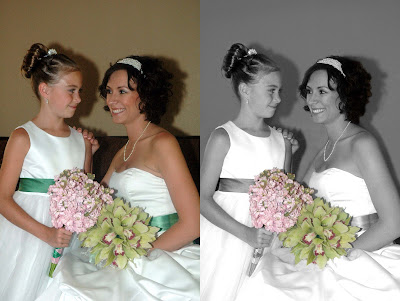
Wedding Before & After Photoshop adjustments
What would you like to learn more about? (please leave a comment)
1) How to “blur” the background?
2) Remove distracting elements in the background? Examples: bright wall, bright tree, shadow line, etc.
3) Retouching tricks? Examples: silhouette of back, pearl necklace, wrinkles, shiny skin, etc.
4) More exposure tricks? Bright background and shaded subject, whiten teeth, etc.
Gelidy Gelato

Wednesday, December 5, 2007

Photoshop Mini-lesson #2

Ever wonder how those Black & White photos with key elements in color are created? In Photoshop there are several way to create this effect. Assuming you are starting with a color photo, the easiest method is #4 (listed below). Using a brush tool you simply paint the areas you want into Black & White (grayscale). It's easy and surprisely fast. (Please Note: The image on the right also includes some retouching. Example: The harsh shadow in the background has been toned down. )

Method 1) Duplicate your image (layer) and convert it to grayscale. In the grayscale layer select the area you want to be in color and “erase” it to let the color version show through (to let the color layer underneath the grayscale layer show though). CONS must be a good with the eraser tool.

Method 2) Carefully select and copy the area you want to be in color. Convert the whole image to grayscale, then convert back to RGB and paste the color selection back in. CONS must be able to select an exact area and you may not like the edge of the area you paste in.

Method 3) Carefully select the area you want to be in color, then choose Select Inverse and invert the selection to encompass the background, then use the Hue/Saturation feature to desaturate the whole backgroud to black and white. CONS also must be able to select an exact area.

Method #4) Begin with your color image, select the Brush tool, in the tool Options Bar, from the pull-down menu select MODE then COLOR. Now, select a brush size that works well for the area you want to make B&W and paint the color away (converts to grayscale). Switch to a smaller brush for the detailed areas.

Photoshop Elements – Everything is in the options bar across the top a) grab a brush, b) set brush style and size, c) set the blending mode to "Color" and d) paint away!

Method 5) Choose Layers > New Adjustment Layer > Hue/Saturation. Observe in the layers palette you've now picked up new Layer, complete with Layer Mask. Move the Saturation slider all the way to the left to desaturate the image, or remove the color. Remember that an adjustment layer is the key because it doesn't disturb the underlying image. Select the Brush Tool, make sure that foreground color is black, select the new layer and paint the area you want in color.

Saturday, November 24, 2007

Photosop mini lesson #1


First lets start with something you probably all ready know but for those Photoshop virgins out there, we will share. The Bar at the left side of the page we will refer to as our toolbar. On the lower right corner of most of the tools you will see a tiny triangle, this means there are other tools that are hiding behind the tool showing. If you click on the tool and keep your mouse button pressed for a few seconds, you will see the pop up menu as displayed above that shows the tools hidden behind. You can move your mouse over and click on one of the other tools to bring it to the forefront on the toolbar and use it as an active tool.

On the toolbar, look to the left column of tools, about midway down you will see that I have clicked on the lollypop looking thing. That is called the dodge tool, behind it are the burn & smudge tools. Lets say you have an object in a photo that is shaded, maybe someones face has a shadow, the Dodge tool can help. If you have an overly bright area, the burn tool could help there.

Dodge & Burn Tools:
First a few tips:
If you have very dark shaded areas, they probably dont have a lot of digital detail so even after using the dodge tool, you could still end up with grayish shadows.
If you have overly lightened areas, the burn tool may not have good results either.
You'll want to use either of these tools in moderation and work on small areas.

1)Click on either of these tools to activate it.
2)Choose your brush (It is usually best to zoom in fairly close to the part of the photo that you are wanting to work on and using softer brushes will blend better to the surrounding parts of the photo)
3)Now Choose the range option you desire
shadows to lighten or darken
midtones to adjust the tones of average darkness
highlights to make the brightest areas even lighter or usually, darker.
4)By using the exposer slider/text box, choose the amount of the effect you want to apply.
5)Now click on the areas of the photo that you would like your desired effect on (or hold down your mouse button and “brush” across the area), until you are satisfied with the outcome. The more times you go over the same spot, the more it will increase the effect. It Be careful not to over-do it but if you do, you can always back up via your History Palette. (Please notify if you need to know more about the History Palette and we'll cover that next)

Below are some samples of using the Dodge tool. Notice how her hair is so dark that it blends into the background, on a few of the photos I did try to lighten her hair too but as the tip above states, due to the lack of digital detail, nothing really resulted.


Original


Using shadows @ 22%


Midtones @ 50%


Highlights @ 25%


Obviously you will get different results for different photos & circumstances. You will need to just play with what looks good to the eye until you find what works.

Tuesday, July 17, 2007

Design Tutorial: Balance

When making your layout for "Objects of my affection" try and incorporate balance.

To understand balance, think of the balance beam. When objects are of equal weight, they are in balance. If you have several small items on one side, they can be balanced by a large object on the other side. Visual balance works in much the same way. It can be affected not only by the size of objects, but also their value (ie. lightness or darkness, termed visual weight).

- Symmetrical Balance: Symmetrical balance is mirror image balance. If you draw a line down the center of the page, all the objects on one side of the screen are mirrored on the other side (they may not be identical objects, but they are similar in terms of numbers of objects, colors and other elements. Sometimes they are completely identical (often seen in architecture).
- Asymmetrical balance: Asymmetrical balance occurs when several smaller items on one side are balanced by a large item on the other side, or smaller items are placed further away from the center of the screen than larger items. One darker item may need to be balanced by several lighter items.
Although asymmetrical balance may appear more casual and less planned, it is usually harder to to use because the artist must plan the layout very carefully to ensure that it is still balanced. An unbalanced page or screen creates a feeling of tension, as if the page or screen might tip, or things might slide off the side, just as the unbalanced balance beam would tip to one side

o By color: Our eyes are drawn by color. Small areas of vibrant color can be used to balance larger areas of more neutral colors. Color is one of the most effective devices available for drawing attention to those page elements you most want noticed. For this device to be effective, your colors must be used sparingly.
o By value: Value refers to the darkness or lightness of objects. Black against white has a much stronger contrast than gray against white. To balance these two colors, you would need a larger area of gray to balance the stronger value of black.
o By shape: Large flat areas without much detail can be balanced by smaller irregularly shaped objects since the eye is led towards the more intricate shape
o By position:
o By texture: Smaller areas with interesting textures (variegated light and dark, or random fluctuations) can balance larger areas with smoother, un-textured looks
o By eye direction: Your eye can be led to a certain point in a picture depending on how the elements are arranged. If the people in a picture are looking in a certain direction, your eye will be led there as well. Elements in a picture, such as triangles or arrows, will also lead your eye to look to a certain point and maintain the balance of a picture.
- Radial Balance: The third type of balance is radial balance, where all elements radiate out from a center point in a circular fashion. It is very easy to maintain a focal point in radial balance, since all the elements lead your eye toward the center
- Crystallographic balance: This kind of balance is also known as "all over" balance. Within a grid-like composition, certain variation is introduced to direct the eye throughout the design, with many focal points. Some familiar examples would be quilt design or a game of checkers in the middle of the game.
However, imbalance can be used to create a mood or tension in your layouts.

Whoever has the most balanced layout will win this prize:http://www.mayaroad.com/new/product_info.php?cPath=1028&selected_box=configuration&products_id=680&PHPSESSIONID=87bf5b301214c22fa2fd09fbe699093b

Tuesday, July 3, 2007

Design Tutorial: Flow

For our second tutorial, we’re going to discuss visual flow in our scrapbook layouts. The elements on your layout should help guide the reader’s eye across the page and to the focal point {usually a photo, if making a multi-photo layout either the group of photos or the best photo of the bunch.} Thus, a layout that has movement is employing good flow techniques.

To establish whether you have visual flow, review one of your layouts and ask yourself the following:
- Does the visual flow work with gravity? Or against it?
- Does the eye flow from one element to the next the way you want it to?
- Count the steps it takes to get to the focal point. Are there more than two?
- In "flash-card" fashion, show the layout (quickly) to an unsuspecting viewer... what's the first thing they saw. Next? Next? Is that what you intended?

There are a few ways to introduce flow to a scrapbook page.
- Employ a sequence of events photographs for multi-photo layouts. If there isn’t a prominent sequence, employ numbers on each photograph to direct the reader’s eye to each photo and end on the focal photo. Make your focal photo larger!
- Use repetition. Too much repetition creates monotony but when used effectively can lead to rhythm, and focalization. Repetition can be achieved with colors, or embellishments. When using embellishments, use an odd number rather than an even number, as it is often more eye pleasing.
- Create a line going across the page. Straight lines tend to be forceful, structural and stable and direct the observer's eye to a point faster than curved lines. Curved or free-flowing lines are sometimes described as smooth, graceful or gentle and create a relaxing, progressive, moving and natural feeling. Create the line with photos or embellishments.

So this week, when you're doing your "stashofont" layouts, make sure your page flows well. I feel inspired today {mostly by Sharon's great challenge} and so the page with the most flow will receive this: http://www.magisticalmemories.com/ProductDetails.asp?ProductCode=TRAMB

Monday, June 25, 2007

Design Tutorial: "Rule of Thirds"


The "rule of thirds" is a compostional rule in photgraphy. A photograph or layout can be divided into nine equal parts using two horizontal and vertical lines. These lines intersect at 4 points and placing the photograph or layout's focal point at these intersections creates drama, tension, energy, and interest.

Here are some examples because I can't post photos right now:

http://photospot2004.blogspot.com/2004/07/rule-of-thirds.html

http://www.digital-photography-tips.net/digital-photography-tutor-thirds.html

So this week, I challenge you to try the rule of thirds yourself. Take a photo both using and not usign the rule and compare them. If you create a layout for Tiff's Beatlemania challenge, place your focal point at the interstion points!
Here are some ideas to incorporate the rule of thirds in your photography:
- line up subjects with the guiding lines {don't center subject}
- if you center a person, line up their eyes with the top horizontal third line
- place the horizon on the top or bottom line instead of the center
- allow linear features in the photograph to flow from section to section

Please remember that these rules are merely guidelines because it is possible to have both stunning layouts and photographs by not following these rules.