Hi aLL.
So I think photo placement is one of our issues and I have thought up of a couple of mini challenges to help us get better at photo placement. I think this is a VITAl part of creating a layout. Having the correct placement ensures your photos are being looked at and your story is being told properly.
That being said, the first mini challenge is to go on the world wide web and find 3 multi-photo layouts {preferably 3 pics or more} that you love, adore, that you dream about creating yourself! In the comments to this post, insert the links to this layout along with your name {aka log in to make the comment}. After this is done, we'll do the second mini-challenge. Hopefully everyone who wants to participate can do so before tomorrow afternoon. These layouts are probably in your bookmarks or in your favorites.
I think this will be fun and I hope you think so too!
Thursday, February 22, 2007

Sunday, February 18, 2007
Weekly Challenge #8: Double Trouble!!
Participants in last week's challenge (may want to put on your glasses as the list is very tiny):
Katie
K
Erica
As always, will update if needed.
Since some (most) of you were too chicken to let your S.O. into your SB nether regions… I guess I will have to go there myself!! (I fear I will be twice as harsh!) Oh, and I wasn't chicken for your information, just really lazy.
Scrap the word: “Trouble”… using as many photos as you’d like along with:
Black CS
3PPs
3 eyelets/brads
1 chipboard letter
Torn vellum (for something other than journaling)
3 tags
Fibers
Katie
K
Erica
As always, will update if needed.
Since some (most) of you were too chicken to let your S.O. into your SB nether regions… I guess I will have to go there myself!! (I fear I will be twice as harsh!) Oh, and I wasn't chicken for your information, just really lazy.
Scrap the word: “Trouble”… using as many photos as you’d like along with:
Black CS
3PPs
3 eyelets/brads
1 chipboard letter
Torn vellum (for something other than journaling)
3 tags
Fibers
Of course, you can always add, but all of the elements listed above must appear somewhere on your page(s)! Ha! There’s no escape!
Sorry, no examples this week… you’re flying blind so spread your wings!
*Warning*
Anyone who wants to participate in challenge #10 will need to dump out their purse and take a picture of it’s contents (and no cleaning it out first!). This gives you two weeks to get the prints!
SHCG Artist Trading Card (ATC) SWAP!!!
 Lucinda's darling little cards were the soul inspiration behind our next proposed swap. I wanted to do something small, cost effective and not quite as time consuming (hopefully) as our Roll Call Swap. This seems like the perfect solution! I think these would make great mementos to include in our SHCG Girlz albums.
Think of an ATC as a tiny scrapbook page or a tag. They are 2.5" x 3.5". You can use any type of A/L free media on the card, but the foundation of the card itself should be made of heavy CS. It is up to you to design the card, but most swaps of this nature have a theme to narrow things down a bit. The theme for this swap will be: "I enjoy being a girl".
Not all trading card enthusiasts subscribe to the A/L free policy, but for our purposes I would ask that you adhere to it. I think Lucinda mentioned covering her finished cards in Mod Podge as a sealant, which would work. If that's not the route you choose then please use quality adhesive. Also note that smoke/odor free products are important, as always, so please be considerate of others in this respect.
Some people make protective paper envies or sleeves for their cards... not necessary, but a nice touch. Some people alter tins to store them in and others use segmented baseball card inserts (the kind that you keep in a binder, like a photo album). I am personally going to make 2 new pages for my Roll Call album with individual paper pockets to store them in (I'll show you guys when I'm done).
Can they be digital? yes, as long as they are printable, obviously.
Can they be 3-D? yes, as long as you use the proper adhesives and A/L free product.
Can they be laminated? I don't see why not.
Can they include a signature or a picture? Again, design elements are totally up to you.
Can they be 3-D? yes, as long as you use the proper adhesives and A/L free product.
Can they be laminated? I don't see why not.
Can they include a signature or a picture? Again, design elements are totally up to you.

You will be making one card for everyone who participates plus yourself. Send ALL of the cards to me and I will distribute them and ship them out. You will get yours back with the rest!
Another plus... these should cost next-to-nothing to ship. Don't worry about sending me an SASE or anything. Just send me the cards and two first class ($.39) stamps. I'll handle the rest. (K and Sarah, just send me a dollar or whatever...)
The DD for shipping will be 3/31/07. I would expect to have all in-hand by 4/9/07. Please keep this mind when you sign up!
Participants should PM me by Friday, 2/23. I would love to have 100% participation! I will post the list on Monday, 2/26.
Below are some links with examples and great tips, tricks and suggestions.
Lucinda's Gallery:
http://scrapbook.com/galleries/105832.html
http://www.tracyroos.com/ATC.htm
Excellent Article with tons of technique suggestion and lots of examples:
http://www.cedarseed.com/air/atc.html
All of the links on this page are pretty useful:
http://www.littlebit.com/links/otherlink/atc.htm
One specific example with step-by-step instructions:
Another plus... these should cost next-to-nothing to ship. Don't worry about sending me an SASE or anything. Just send me the cards and two first class ($.39) stamps. I'll handle the rest. (K and Sarah, just send me a dollar or whatever...)
The DD for shipping will be 3/31/07. I would expect to have all in-hand by 4/9/07. Please keep this mind when you sign up!
Participants should PM me by Friday, 2/23. I would love to have 100% participation! I will post the list on Monday, 2/26.
Below are some links with examples and great tips, tricks and suggestions.
Lucinda's Gallery:
http://scrapbook.com/galleries/105832.html
http://www.tracyroos.com/ATC.htm
Excellent Article with tons of technique suggestion and lots of examples:
http://www.cedarseed.com/air/atc.html
All of the links on this page are pretty useful:
http://www.littlebit.com/links/otherlink/atc.htm
One specific example with step-by-step instructions:
Sarah's very useful link with many examples:
More examples within the same link:
If all goes well and you guys are into this swap then we can always do additional ATC swaps with different themes... there is a whole online community devoted to them, as you'll see if you explore the links above.
Monday, February 12, 2007
(Bump) Weeks 6 & 7 Challenge: Significant Other w/ a Twist
This week's challenge will actually be taking up both week #6 and #7. I have to admit, this is a Robyn original (to the best of my knowledge) so you have only me to blame for this idea. With Valentine's Day around the corner I of course wanted to do a significant other related challenge, but it's all been done, kwim? So... I have decided to put a twist on it. The challenge, should you choose to accept it, is to turn your significant other loose in your stash! You heard (read) me right girlz!
My proposal is this: choose a picture (or multiple pictures) of yourself or anything really, give them to hubby/bf and let him choose 4 sheets of PP and 3 embellies from you stash that he wants you to use to scrap them. I thought this may be especially good for your girlz working on your BOMs right now. You can add to the other person's selection, but you have to use the embellies/papers he pics out. Just to clarify, if they pick out a whole sheet of stickers I don't expect you to use all of them, but you must use at least one. It doesn't have to be your hub or a BF for you to do the challenge. It can be a friend, one of your kids, etc. NO CHEATING! Remember, you had two weeks... til SUNDAY 2/18! See ya in the thread...
Wednesday, February 7, 2007
Style: Vintage, Romantic, Shabby Chic, Retro
Vintage/Romantic/Shabby Chic: A close cousin to the Ephemera style, this look combines patterned papers and uses lots of embellishments, but also features lighter colors like pale pink, dusty mauve and light blue. It’s a well-worn, well-loved look, often including torn paper, inked edges and chalked paper. You might also find embellishments that look as though they’re straight from your grandmother’s sewing box: Buttons, thread, metal accents and ribbons or fiber. Think of those wrought-iron beds featured in home decorating magazines and you’ll know what I mean. Use this style for any feminine pages, especially heritage. It’s also a great look for travel pages.
Vintage: Refers to an artistic style. The colors and patterns of your papers, the type of embellishments and the distressing techniques you use all determine a “vintage” style. The colors? Soft shades like rose, ivory and mint green, plus a few bold colors such as burgundy and teal. Embellishments? Think Grandma's sewing box. This means buttons, ribbons, silk flowers, lace and stitching. Distressing? Quick, simple distressing techniques like inking, chalking or sanding the edges of your papers or embellishments or lightly crumpling your papers all lend to a “vintage” style.

Vintage: Refers to an artistic style. The colors and patterns of your papers, the type of embellishments and the distressing techniques you use all determine a “vintage” style. The colors? Soft shades like rose, ivory and mint green, plus a few bold colors such as burgundy and teal. Embellishments? Think Grandma's sewing box. This means buttons, ribbons, silk flowers, lace and stitching. Distressing? Quick, simple distressing techniques like inking, chalking or sanding the edges of your papers or embellishments or lightly crumpling your papers all lend to a “vintage” style.
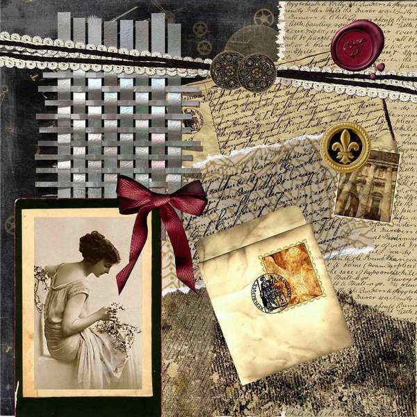
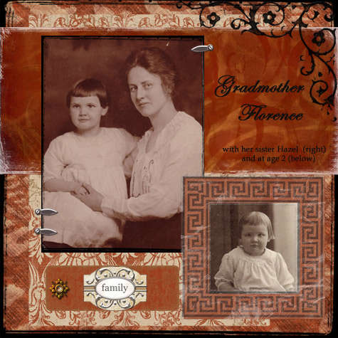


Shabby-chic: Comfortable, cozy, and homey. The look is vintage and worn (the look of old cracked china and furniture that's been lightly sandpapered). Anything that looks distressed, aged, scuffed, worn, torn, or otherwise abused can find a home in a shabby chic layout. Shabby-chic scrappers use plenty of tendrils, flowers, and pastels in the form of papers, stickers, die-cuts, and other embellishments. Torn, stitched, and inked papers are commonly found in these albums, and so are pastel, solid, and patterned papers.
Eclectic and fun. Shabby-chic style often features journaling tags, eyelets and laces, chalk techniques, and crumpled papers. Computer-generated fonts that suggest early 20th-century handwriting styles commonly are used for journaling in shabby-chic scrapbook layouts.


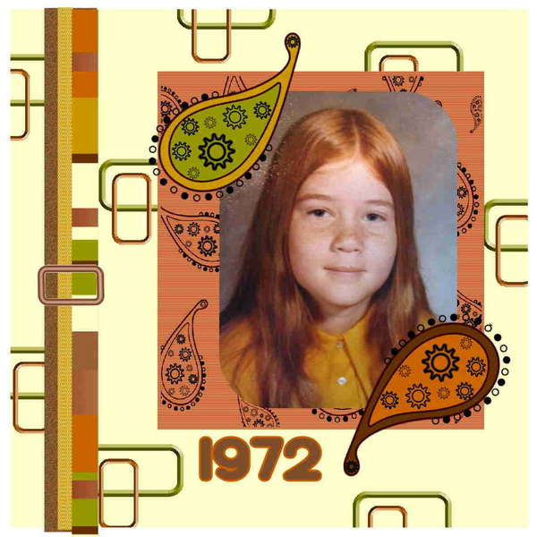
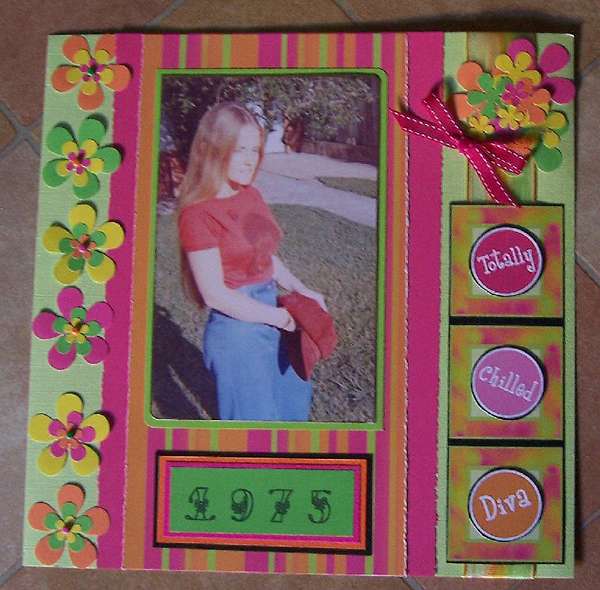
Retro: Retro is a hot style right now, in just about everything from stationery and gifts to scrapbooking. While “retro” means different things for people of different ages, it’s really reminiscent of the styles from the 1950's through the 1970's. You’ll find lots of pink and black, pink and brown and blue and brown color combinations, plus cool images and shapes like spirals and big flowers. Whether or not you liked it the first time around, the look is much more contemporary now—and teens and kids love it. Exactly which colors are used depends on the decade you are aiming to evoke.

3-D Style and Clean and Simple Style


Tuesday, February 6, 2007
Styles: Ineractive, Mosaic, Grunge, Heritage

This my idea of "mosaic". A LO that has some sort of picture that is in many pieces, separated, but still able to tell what the picture was in the first place. I remember seeing a LO before in the gallery where it was a landscape picture, and it was cut into three pieces, matted in black, and separated across the page. The outer two pieces were skinnier than the center one. I liked that one too. But Katie did a good job on this one too.. the picture being separated in pieces like this is what looks like mosaic to me.


I think this was my favorite one to look for. I love love love old photos.. and how beautiful and pure women always seemed to look. I picked these because they just, to me, are beautiful and pure and what i see to be someone's heritage.




These two kind of fit in my category as "grunge". I'm not quite sure why, i think they both have the look of not being so "pretty and perfect" but went out of the linear perfectness. The left pic they kind of painted a little over the picture. The right,there is a lot of "worn" spots all over the yellow paper. To me, i always see grunge as a construction worker just getting home from work before a shower. lol.. not pretty and/or perfect. haha anyways.


Subscribe to:
Posts (Atom)