Ever wonder how those Black & White photos with key elements in color are created? In Photoshop there are several way to create this effect. Assuming you are starting with a color photo, the easiest method is #4 (listed below). Using a brush tool you simply paint the areas you want into Black & White (grayscale). It's easy and surprisely fast. 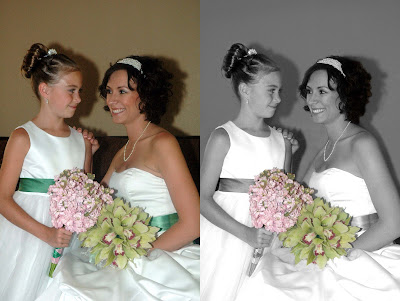 (Please Note: The image on the right also includes some retouching. Example: The harsh shadow in the background has been toned down. )
Method 1) Duplicate your image (layer) and convert it to grayscale. In the grayscale layer select the area you want to be in color and “erase” it to let the color version show through (to let the color layer underneath the grayscale layer show though). CONS must be a good with the eraser tool.
Method 2) Carefully select and copy the area you want to be in color. Convert the whole image to grayscale, then convert back to RGB and paste the color selection back in. CONS must be able to select an exact area and you may not like the edge of the area you paste in.
Method 3) Carefully select the area you want to be in color, then choose Select Inverse and invert the selection to encompass the background, then use the Hue/Saturation feature to desaturate the whole backgroud to black and white. CONS also must be able to select an exact area.
Method #4) Begin with your color image, select the Brush tool, in the tool Options Bar, from the pull-down menu select MODE then COLOR. Now, select a brush size that works well for the area you want to make B&W and paint the color away (converts to grayscale). Switch to a smaller brush for the detailed areas.
Photoshop Elements – Everything is in the options bar across the top a) grab a brush, b) set brush style and size, c) set the blending mode to "Color" and d) paint away!
Method 5) Choose Layers > New Adjustment Layer > Hue/Saturation. Observe in the layers palette you've now picked up new Layer, complete with Layer Mask. Move the Saturation slider all the way to the left to desaturate the image, or remove the color. Remember that an adjustment layer is the key because it doesn't disturb the underlying image. Select the Brush Tool, make sure that foreground color is black, select the new layer and paint the area you want in color.
(Please Note: The image on the right also includes some retouching. Example: The harsh shadow in the background has been toned down. )Method 1) Duplicate your image (layer) and convert it to grayscale. In the grayscale layer select the area you want to be in color and “erase” it to let the color version show through (to let the color layer underneath the grayscale layer show though). CONS must be a good with the eraser tool.
Method 2) Carefully select and copy the area you want to be in color. Convert the whole image to grayscale, then convert back to RGB and paste the color selection back in. CONS must be able to select an exact area and you may not like the edge of the area you paste in.
Method 3) Carefully select the area you want to be in color, then choose Select Inverse and invert the selection to encompass the background, then use the Hue/Saturation feature to desaturate the whole backgroud to black and white. CONS also must be able to select an exact area.
Method #4) Begin with your color image, select the Brush tool, in the tool Options Bar, from the pull-down menu select MODE then COLOR. Now, select a brush size that works well for the area you want to make B&W and paint the color away (converts to grayscale). Switch to a smaller brush for the detailed areas.
Photoshop Elements – Everything is in the options bar across the top a) grab a brush, b) set brush style and size, c) set the blending mode to "Color" and d) paint away!
Method 5) Choose Layers > New Adjustment Layer > Hue/Saturation. Observe in the layers palette you've now picked up new Layer, complete with Layer Mask. Move the Saturation slider all the way to the left to desaturate the image, or remove the color. Remember that an adjustment layer is the key because it doesn't disturb the underlying image. Select the Brush Tool, make sure that foreground color is black, select the new layer and paint the area you want in color.