Wednesday, February 7, 2007

Style: Vintage, Romantic, Shabby Chic, Retro

Vintage/Romantic/Shabby Chic: A close cousin to the Ephemera style, this look combines patterned papers and uses lots of embellishments, but also features lighter colors like pale pink, dusty mauve and light blue. It’s a well-worn, well-loved look, often including torn paper, inked edges and chalked paper. You might also find embellishments that look as though they’re straight from your grandmother’s sewing box: Buttons, thread, metal accents and ribbons or fiber. Think of those wrought-iron beds featured in home decorating magazines and you’ll know what I mean. Use this style for any feminine pages, especially heritage. It’s also a great look for travel pages.

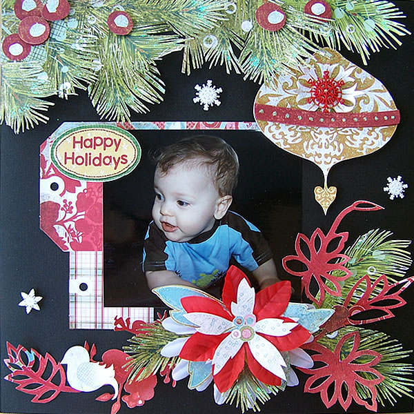
Vintage: Refers to an artistic style. The colors and patterns of your papers, the type of embellishments and the distressing techniques you use all determine a “vintage” style. The colors? Soft shades like rose, ivory and mint green, plus a few bold colors such as burgundy and teal. Embellishments? Think Grandma's sewing box. This means buttons, ribbons, silk flowers, lace and stitching. Distressing? Quick, simple distressing techniques like inking, chalking or sanding the edges of your papers or embellishments or lightly crumpling your papers all lend to a “vintage” style.


Romantic: This includes floral patterns, velvets, lace, and usually soft, warm colors. The text is often created using a script or an ornate, embellished lettering.


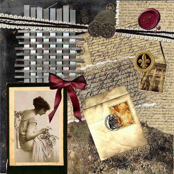
Shabby-chic: Comfortable, cozy, and homey. The look is vintage and worn (the look of old cracked china and furniture that's been lightly sandpapered). Anything that looks distressed, aged, scuffed, worn, torn, or otherwise abused can find a home in a shabby chic layout. Shabby-chic scrappers use plenty of tendrils, flowers, and pastels in the form of papers, stickers, die-cuts, and other embellishments. Torn, stitched, and inked papers are commonly found in these albums, and so are pastel, solid, and patterned papers.

Eclectic and fun. Shabby-chic style often features journaling tags, eyelets and laces, chalk techniques, and crumpled papers. Computer-generated fonts that suggest early 20th-century handwriting styles commonly are used for journaling in shabby-chic scrapbook layouts.


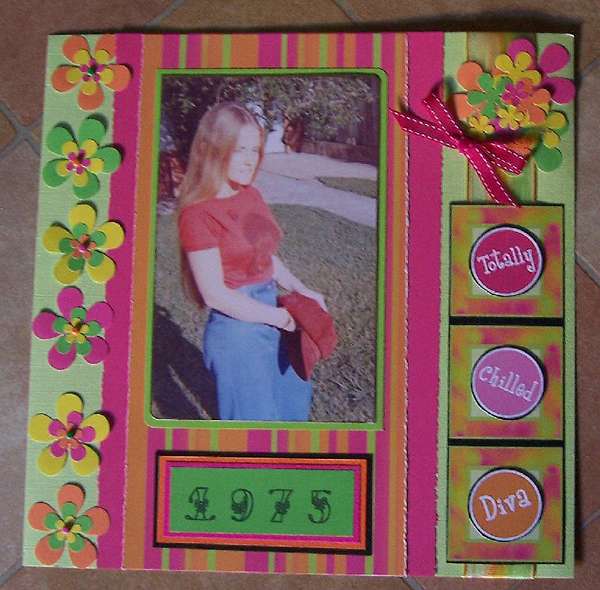
Retro: Retro is a hot style right now, in just about everything from stationery and gifts to scrapbooking. While “retro” means different things for people of different ages, it’s really reminiscent of the styles from the 1950's through the 1970's. You’ll find lots of pink and black, pink and brown and blue and brown color combinations, plus cool images and shapes like spirals and big flowers. Whether or not you liked it the first time around, the look is much more contemporary now—and teens and kids love it. Exactly which colors are used depends on the decade you are aiming to evoke.


3-D Style and Clean and Simple Style

Clean and simple style: For me all the los with photos and journaling that do not use tons of embellishments or the latest techniques fall in to this category.


3-D style
: For me 3-D is everything that is not flat:
buttons, shaker boxes, beads, flowers.


Tuesday, February 6, 2007

Styles: Ineractive, Mosaic, Grunge, Heritage


This my idea of "mosaic". A LO that has some sort of picture that is in many pieces, separated, but still able to tell what the picture was in the first place. I remember seeing a LO before in the gallery where it was a landscape picture, and it was cut into three pieces, matted in black, and separated across the page. The outer two pieces were skinnier than the center one. I liked that one too. But Katie did a good job on this one too.. the picture being separated in pieces like this is what looks like mosaic to me.


I think this was my favorite one to look for. I love love love old photos.. and how beautiful and pure women always seemed to look. I picked these because they just, to me, are beautiful and pure and what i see to be someone's heritage.


These two kind of fit in my category as "grunge". I'm not quite sure why, i think they both have the look of not being so "pretty and perfect" but went out of the linear perfectness. The left pic they kind of painted a little over the picture. The right,there is a lot of "worn" spots all over the yellow paper. To me, i always see grunge as a construction worker just getting home from work before a shower. lol.. not pretty and/or perfect. haha anyways.


This LO, for me, is what i see to be an interactive one. Something that has some sort of hidden journaling that you have to literally touch the LO and move something in order to read or see another thing that is hidden on purpose.

Style: Ephemera

Ephemera is best defined as: items designed to be useful or important for only a short period of time (dictionary.com). A good example of this is tickets, the main purpose is for you to use them to get into a show, game, etc. After that you no longer need them anymore and they are useless. However, if you scrapbook they can be used to help tell the story of a certain event.


In this layout ephemera was used to help tell the story. Ways of doing this is to take tickets, pamphlets, maps, anything and casually put it on the layout. You can even hide the ephemera in pockets or envelopes if you don't want it to show.


Another way to use ephemera is as the main focus of the layout. This is a great example of that, there are no photos only tickets and receipts to describe what this scrapper had done the past year.


This layout is an example of using ephemera as an embellishment or paper. Even ordinary everyday items can be used to do this.
The most important thing to remember when using ephemera is that most items are not acid free. There are several ways of fixing this:
1. Use an achival mist to neutralize the acid.
2. You can make a copy of the ephemera and print it on acid free paper or photo paper.
3. You can take a photo of the ephemera and put it on your layout.

Scrapping Styles: Naturalist, Playful, Pop Art & Punk

Naturalist: This, to me, means a combination of scrapping photos of nature & using nature-inspired papers and embellishments to do so.

Examples:


Playful: I think this is a very loosely defined category. Subject matter can be playful, as in the following example:


or, visual style can be playful, as in the following examples:


Pop Art: Using the anonymous, everyday, standardized, and banal iconography in American life, as comic strips, billboards, commercial products, and celebrity images.

A few excellent examples of pop art scrapping:


Punk: This was a tough one. In my opinion, punk scrapping should be edgy, both the photos and the paper/embellishments used. The subject matter should suit the design. I found it very difficult to locate layouts that I really felt fit this description, but here are a few:


I think the first two are the closest to what I would truly consider "punk" but I think there is a bit left to be desired still - I'm going to attempt to create what I would consider a true punk layout in the next few weeks to see if it is even possible to apply this medium fully to scrapping.

Scrapbook Styles {Collage, Contemporary, Distressed and Doodley}

COLLAGE: the word collage comes from the French word ‘to paste’ and here are some popular definitions:
Collage is any piece of art with an additional layer glued on the surface. (National Collage Society)

A picture or design created by adhering such basically flat elements as newspaper, wallpaper, printed text and illustrations, photographs, cloth, string, etc., to a flat surface, when the result becomes three-dimensional. (collagetown.us)

Collage is an art form in which the artist creates or takes a number of items and places them together within the boundaries of paper, frame or screen. The goal is to craft a message or feeling by the very patterns and content. (collagetown.com)


Collage scrapbooking has the same goal as stated above and combines photos, journaling and often ephemera to help provoke a message.


How can I achieve this look in my scrapbooking? The following companies cater to collage scrapbooking: Paper Love Designs, K and Company, Sandylion, Reminiscence.

How can I incorporate a collage in my layout? Start with a blank piece of cardstock and layer materials to convey a message by its very patterns and content. Collage often have torn pieces of paper arranged to create the background. Arrange and re-arrange until you achieve your desired look. Tips: don’t clutter areas around photos, if using ephemera: scan or photocopy you can also resize to help it fit.


Notice in this layout all of the objects are layered and evoke a fun feeling about adolescent years. The journaling also is a quote for silly times during this era.

CONTEMPORARY art is classified as the art of the late 20th and early 21st century. All the definitions seem to be synonymous with modern art and serious art, which are difficult to classify. Since this art is fairly recent, it does not hold its place within the history books. Much of the meaning of contemporary art comes through implication, rather than by way of explicit statement.

Contemporary scrapbooking is a large family, which is home for several subdivisions of scrapbooking, including: Bold, Pop, Modern, Geometric, Linear, and Asymmetrical.

This style is innovative and fun. These scrapbookers seek out the newest products and use them in original ways. Colors tend to be bold and dramatic, and papers are alive with movement. Photos and other elements are often placed at angles. Journaling is lively and often sports a pithy quote or two. (scrapjazz.com)


How can I achieve this look in my scrapbooking? The following companies cater to contemporary art: SEI, Arctic Frog, Sassafrass Lass, and KI Memories.


How can I incorporate modern art in my layouts? Use patterned paper as a background and mix several types, shades, colors, and hues.


Notice in this layout the paper and embelishments are not "love themed" but the overall layout is about this subject. The colors are bold and unique and modern.

DISTRESSING in terms of art is the activity to make an item appear aged or older.

The goal of distressing is to achieve a less-than-perfect look or vintage look. Shabby shic style incorporates a lot of distressed elements. (scrapjazz.com)

How can I achieve this look in my scrapbooking? The following companies cater to distressed art: Tim Holtz inks, Daisy D, Making Memories {they sell a distressing kit}


How can I incorporate distressed elements in my layouts? Ink the edges of your patterned paper or die cuts, sand the edges of chipboard titles, photos, cardstock or metal, use pre-distressed paper! Tear paper, crumple paper, rub paper with metallic rubons or ink, dry brush paper with acrylic paint, rub paper with walnut ink. Tips: crumple and sand paper to reveal its inner white core, sanding softens boldness of colors, use white wash over patterned paper to dull its vibrancy, distressing is a great way to bring masculinity to embellishments.

Notice in this layout that an old world calendar was created by inked edges. The map was printed using muted colors and the background patterned paper was pre-distressed.


DOODLEY art is when penwork is used as an accent. In terms of scrapbooking, penwork comprises of a large portion of the layout.

How can I achieve this look in my scrapbooking? The following companies cater to doodley art: Sakura, American Crafts, Zig. Once the tools are in hand, practice. Practicing can be simple: start doodling whilst on the telephone, or doodle on your grocery list. “Mistakes” are often made in doodling and doodles are seldom perfect.

How can I incorporate doodles into my layouts? Use them to accent die cuts, handwrite your journaling on doodle lines, draw them onto your page adding basic shapes in the corners, add them to a subtitle or word, accent a pre-made embellishment, mix them with paint! Tips: the more you doodle, the better you will become, use pens you are comfortable with, position your hand away from the page to not smear your doodles.

Monday, February 5, 2007

Example of "Classic" style

In my view, this LO could not be more classic. Complete with the favorite family recipe, linear in design, no trendy embellishment and theme-related PP. The title and the journaling are straight to the point. It would be impossible to date this LO by appearance alone (if the date were not journaled onto the page). This is what represents the classic style in my mind's eye.

Sunday, February 4, 2007

Weekly Challenge #6 & 7...SIGNIFICANT OTHER (with a twist)

Hats off to the Complementary Color challenge (WC #5) participants:

  1. Moi
  2. Mel
  3. K
  4. Jessica
  5. Katie
  6. Me
  7. Brenda

As always, will update if necessary!

This week's challenge will actually be taking up both week #6 and #7. I have to admit, this is a Robyn original (to the best of my knowledge) so you have only me to blame for this idea. With Valentine's Day around the corner I of course wanted to do a significant other related challenge, but it's all been done, kwim? So... I have decided to put a twist on it. The challenge, should you choose to accept it, is to turn your significant other loose in your stash! You heard (read) me right girlz! My proposal is this: choose a picture (or multiple pictures) of yourself or anything really, give them to hubby/bf and let him choose 4 sheets of PP and 3 embellies from you stash that he wants you to use to scrap them. I thought this may be especially good for your girlz working on your BOMs right now. You can add to the other person's selection, but you have to use the embellies/papers he pics out. Just to clarify, if they pick out a whole sheet of stickers I don't expect you to use all of them, but you must use at least one. It doesn't have to be your hub or a BF for you to do the challenge. It can be a friend, one of your kids, etc. NO CHEATING! Remember, you have two weeks! See ya in the thread...